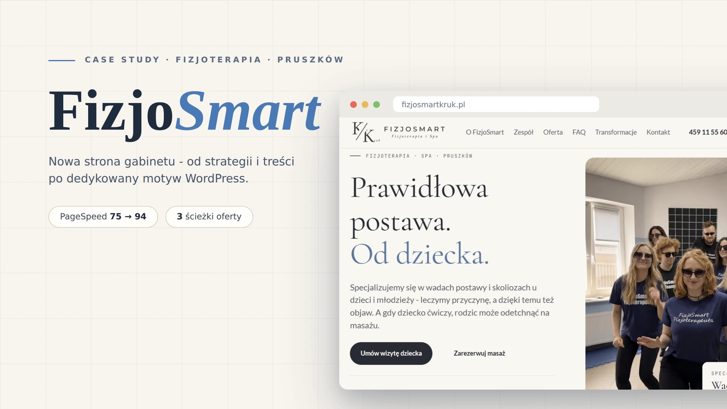
FizjoSmart - a website that tells you in 5 seconds what the clinic is really good at
FizjoSmart is a physiotherapy and SPA clinic from Pruszków, Poland, run by Katarzyna Kruk. A team of eight specialists, FITS and BSPTS certifications, a strong specialisation in posture defects and scoliosis in children. The problem: none of this could be read from the old website. It said "physiotherapy and SPA", showed team photos and a Booksy button. The task was not "make a prettier website" but: show online what patients only discover once they are in the clinic.
- 3 pathsin the offerchildren, adults, SPA & massage - previously one generic subpage
- 7 stagesof the therapy processfrom examination to patient independence - previously missing
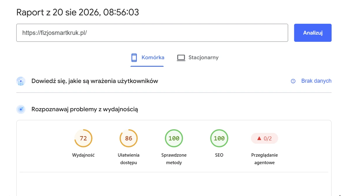
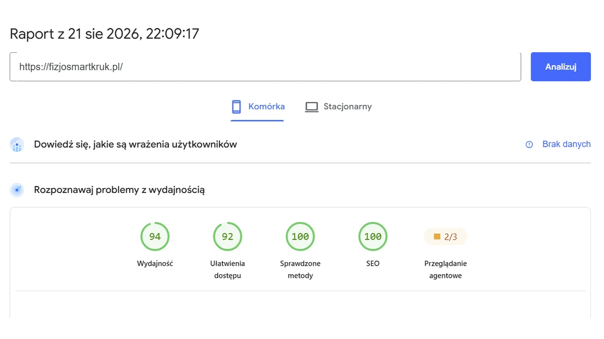
- 94/100PageSpeed mobileup from 75 to 94 points
- 92/100accessibilitypreviously 86 points
A good clinic that was impossible to see
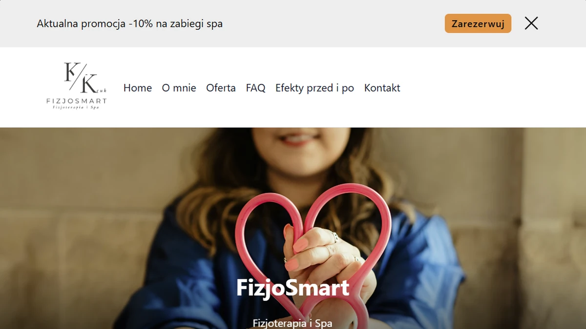
The old website did what most clinic websites do: it said the clinic exists. A generic "physiotherapy and SPA" offer, a price list on a separate subpage in the form of a treatment catalogue, no description of what a visit looks like, and therapy results hidden away on Instagram. A parent looking for help for a child with scoliosis and someone booking a Kobido massage landed on exactly the same content.
And these are completely different patients. Before the first visit a parent has very concrete questions: does it hurt, what does the examination look like, does anyone here actually know how to work with children. The price could be found, but the rest of the questions had to be answered by a phone call - or by a competitor.
What was done and why it made sense
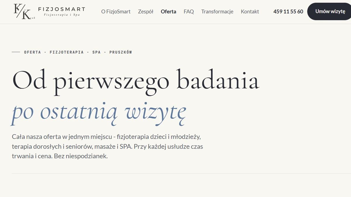
Specialisation on the first screen
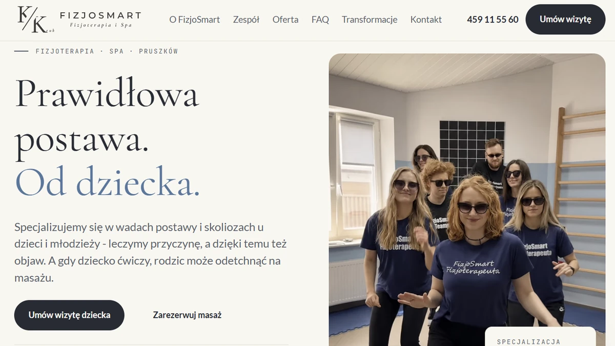
The biggest change is not visual but strategic. Instead of "physiotherapy and SPA", the website communicates from the very first screen: we specialise in posture defects and scoliosis in children and teenagers. It is a bold decision, because it seemingly narrows the client base. In practice it works the other way round: every town has a dozen generalists, but only a few specialists in children's scoliosis.
Three paths instead of one offer
I split the offer into three clear segments: children, adults, SPA & massage. Each has its own language, its own services and its own CTA. Users do not read through the whole offer - they immediately turn into their own path.
The therapy process laid out in 7 stages
A parent who knows what will happen at the first visit books more willingly. So instead of promises, the website shows a concrete scheme: from examination, through a therapy plan, to the patient's independence. This builds expert authority better than any slogan and removes the most common concerns before the phone call even happens.
Prices in context, not in a catalogue
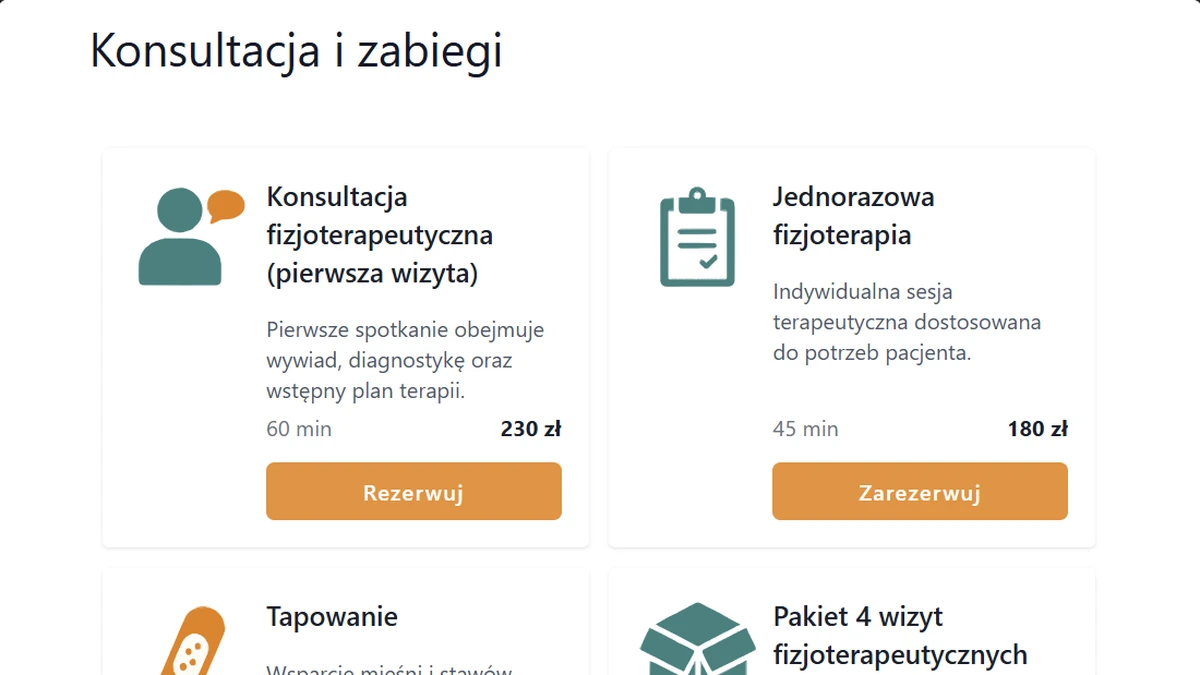
Prices were already on the old website, but as one shared treatment catalogue on the offer subpage. On the new website the price and duration sit next to the specific service, inside the right path: a parent sees the cost of a children's consultation next to a description of what that consultation looks like. A price served together with answers to their questions stops being a barrier and starts being information.
Proof on the website, not next to it
A 4.9/5 Booksy rating, an FAQ section, the Orły Medycyny award, Instagram transformations linked exactly where the user makes a decision. Previously all the social proof lived outside the website. Now the website puts it to work, and booking can start in three ways: through Booksy, by phone or via the contact form.
A custom WordPress theme: fast for patients, simple for the owner
Everything runs on a custom WordPress theme: no page builders, no off-the-shelf template with a thousand unused options. Clean code, fast loading on mobile (which is how parents usually search), heading structure and structured data targeting local phrases like "child scoliosis Pruszków". There is also a second side to this decision, less visible in the screenshots: the content is built on Gutenberg blocks, the standard WordPress editor. The owner changes a price, a text or a photo herself, with no developer and no page builder licence fees. The effect shows in the numbers: after launch the website scores 94 points for mobile performance in PageSpeed against 75 for the old version, and accessibility went up from 86 to 92.
Results after launch
The website stopped being a brochure and started working like the first conversation with a patient.
- A clear specialisation visible from the first screen
- Three offer paths instead of one generic subpage
- A therapy process laid out in 7 stages
- Prices and durations shown next to services, in the context of each path
- A 4.9/5 Booksy rating and FAQ directly on the website
- Booking through three channels: Booksy, phone, contact form
- Content edited independently by the owner in Gutenberg blocks
- Mobile performance 94/100 in production, old website: 75
- Accessibility 92/100 (previously 86), best practices and SEO both 100/100
- Total Blocking Time 0 ms (previously 20 ms)
- Structure and content prepared for local search phrases in and around Pruszków
Technologies
- WordPress - custom theme
- No page builders
- Gutenberg blocks - self-service editing
- Schema.org (LocalBusiness, FAQ)
- Booksy booking links
- PHP 8.1
- SCSS
- Webpack